If I could only apply a single design principle or improve one thing about a landing page, web application, or software-as-a-service (SaaS) platform, it would most definitely be consistent margins and paddings.

Focusing on margins to better show what's important is something I recommend in the majority of my SaaS UX reviews. Here's how improving your margins and padding will make a huge difference for your product.
It'll look much better, which you'll notice right away when looking at the before-and-after pictures of your SaaS' design.
Your SaaS will be easier to use, which keeps your users actively using your product.
And finally, active users mean less churn and more MRR for you as a founder.
But how does that work? In this article, I will explain how margins and paddings will instantly improve all of the above and your web design skills. Let's take a look.
When working with margins on a landing page or application, you need to keep three main things in mind.
Creating a visual hierarchy
Readability
Consistency
To create the above, you first need a base unit for your margins. Common choices are 5px and 8px. Both are fine, but I always go for 8px because it works very well with common font sizes (16, 24, and 32px).
That's consistency right there because the recommended 150% line height puts you at multiples of 8 for the 16px and 32px font size.
Let's say you use 8px as the base unit for your margins. Next, you'll need a margin multiple from 1 to 5 to set up your visual hierarchy.
8px
16px
24px
32px
40px
Consider your page sections as the biggest units on your page and a single element (like a paragraph or image) as the smallest unit.
As a rule of thumb, margins between sections are bigger than margins between elements within a section. You go from big units with big margins to small units with small margins.
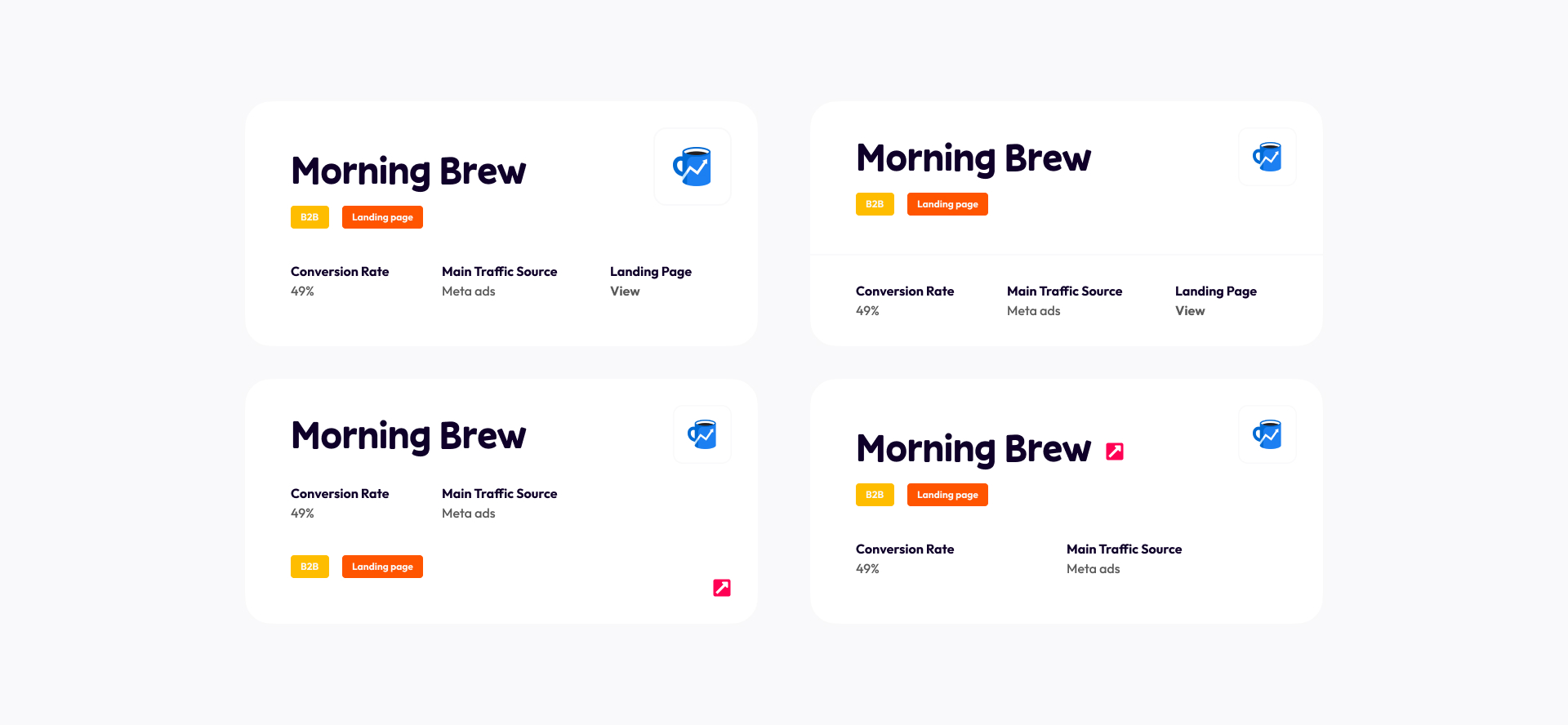
Let's look at an example. In the image above, I've used the 5x multiple for margins between sections. It is a large margin for large sections. When you look within a section, you'll see that I use smaller margins.
For example, this card section is divided into two subsections (the text and the card list). I use a 24px margin (3x multiple) between these subsections and an 8px margin (1x multiple) for elements within the subsections.
The theory I apply here is called Gestalt principles, and it teaches us how grouping and proximity make certain elements look like they belong together.
That's super important for an easy flow through your content. When properly aligned, your users can scan your pages on autopilot, which will have a positive effect on your conversion rate (landing pages) and task completion rate (SaaS pages).
Both directly impact your user count and MRR.
Let's discuss padding next. They're less impactful than margins but are still important to consider.
What's the difference? Margins are the space between sections, and padding is the space within a section between its content and the section border.
Padding between content helps a lot with readability. More 'breathing room' gives users more time to process what they've just read on your website.
In addition, more or less padding also influences the visual identity of your platform. Lots of padding (32px and up) is associated with a playful design, for example.

The image above shows a design I made for Louis Nicholls' Grow My Newsletter platform. I've used a padding of 56px for the cards in the image. That's huge!
See how it's easy to read and how the paddings (combined with the colorfulness) create an accessible, playful look and feel.
By the way, don't forget to include padding in your responsive design thinking. On smaller screens, you'll need less padding.
That's all you need to know about margins and padding in web and software design. It is one of the many ways you can apply UX to boost your SaaS MRR.
I'm discussing margins, padding, and much more in my UX for Founders course. It is all about using UX principles to convert more visitors into returning users for your SaaS.
If you could use some extra help growing your SaaS through UX design, feel free to reach out. I'd be more than happy to let you know the ways I could help you do exactly that.